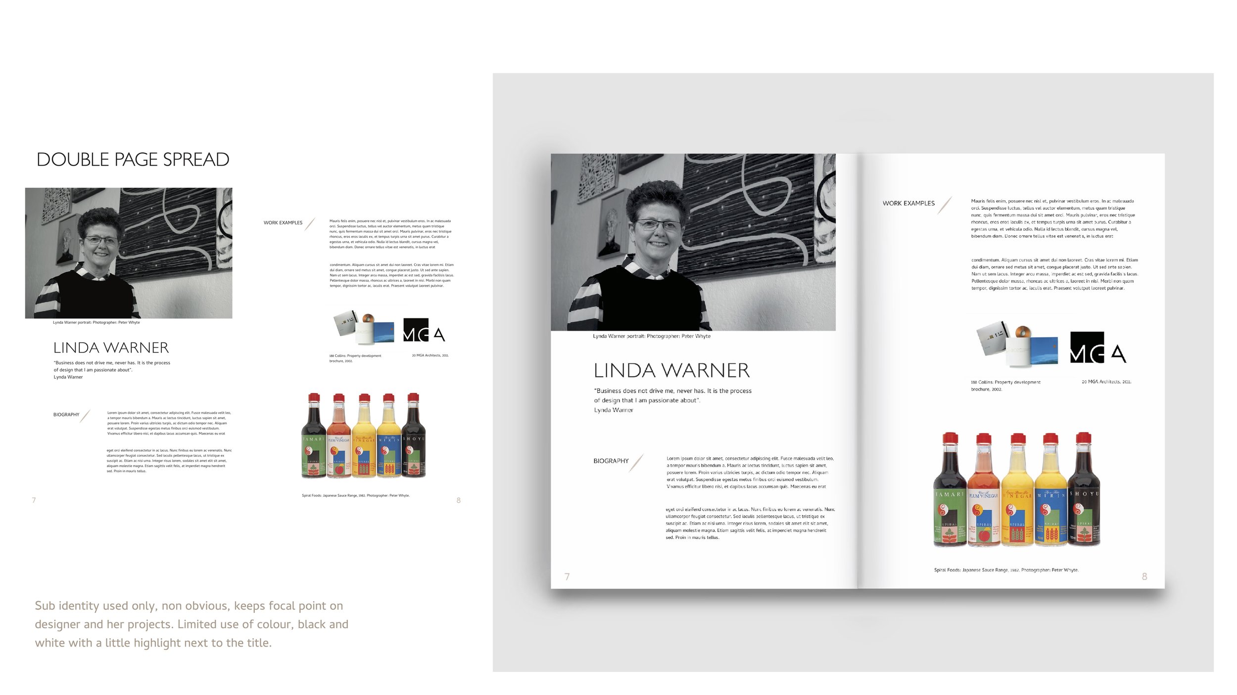
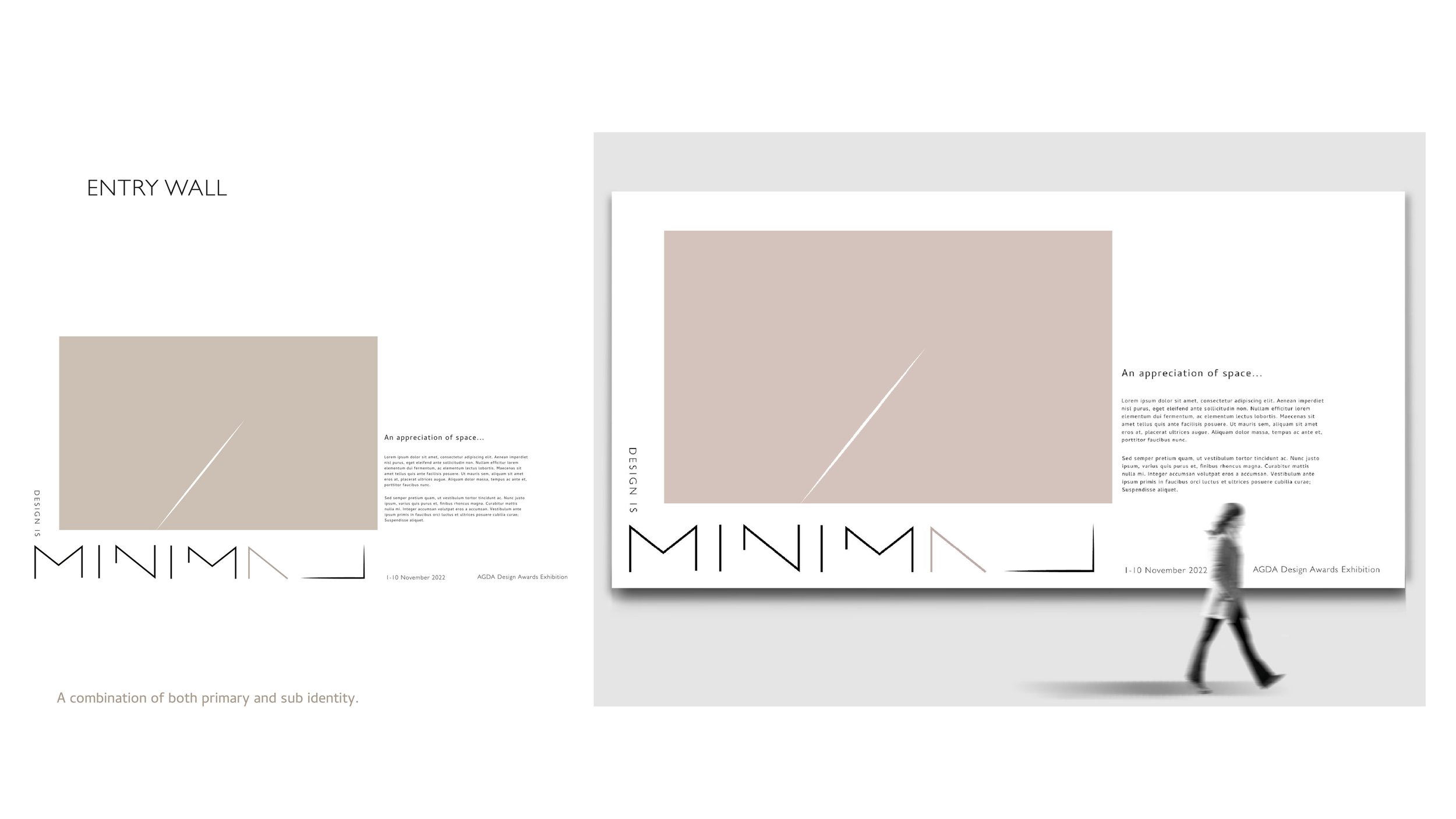
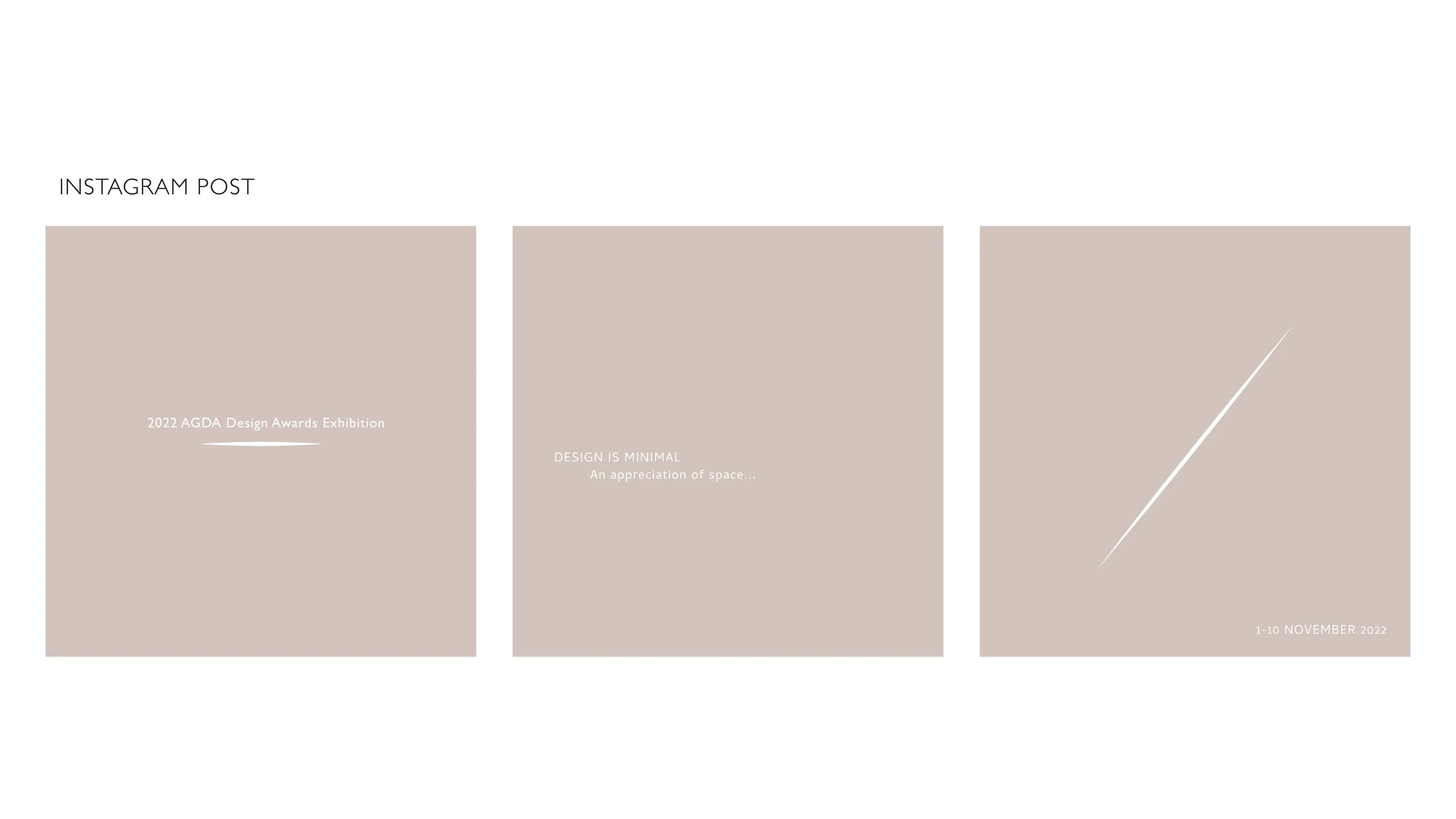
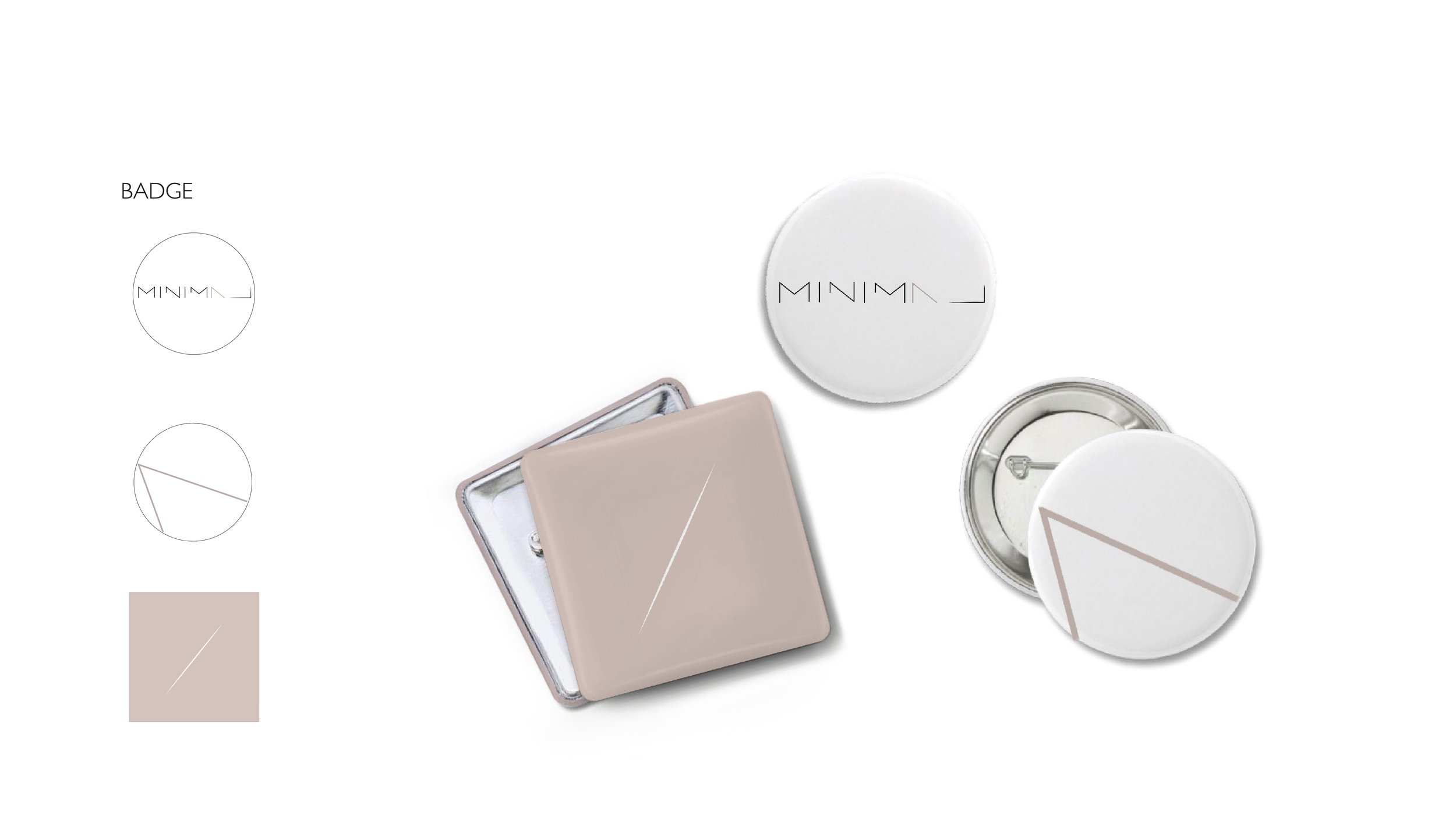
Design Is Minimal
Visual identity system for AGDA Design Awards 2022.
Based off the concept “design is minimal”. Adopting the least amount of design elements to create a simple and aesthetic design is the proposal for the theme. This has been taken into practice through the limited use of colour and elements to reinforce the design philosophy of “less, but better” (Dieter Rams).
The consistent white line cutting through the warm tone beige symbolises the smallest amount of material consumption within a given space. The angle of the line is taken from the letters in the main logo where the angle also runs consistently across the word, once again limiting to the least number of differences in the identity system. Further by shaping the end of the line into a point represents a small delicate cut through the page, reflecting the careful considerations required within a design. Lines from the letters in the logo has also been purposefully shortened and taken away emphasising the minimal use of material. Lastly, the warm beige being the only colour used, delivers the sense of comfort and simplicity as it is often negotiated with the meaning of “plain and soothing”.